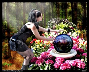
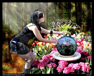
Some photos from recent shoot

Sukerkin

Have the courage to speak softly
MT Mentor
Lifetime Supporting Member
MTS Alumni
Joined
Sep 15, 2006
Messages
15,325
Reaction score
493
Location
Staffordshire, England
First - EEK! A palantir!!! What are you doing girl!? :D

Second, I think you need to do the digital equivalent of burning the overly lighted right shoulder and upper back. The brightness draws the eye away from the focus (no pun intended) of the shot.
 

Sukerkin

Have the courage to speak softly
MT Mentor
Lifetime Supporting Member
MTS Alumni
Joined
Sep 15, 2006
Messages
15,325
Reaction score
493
Location
Staffordshire, England
Rats! Hmm - could you use a few texture painting tools to bring back something to work with?
 
OP
Bob Hubbard

Bob Hubbard

Retired
MT Mentor
Founding Member
Lifetime Supporting Member
MTS Alumni
Joined
Aug 4, 2001
Messages
47,245
Reaction score
772
Location
Land of the Free
I probably could, but that's a lot of work, I'd hazard 10-20 hrs of digital skin grafts and blending. easier to reshoot under better lighting, lol!
 

Sukerkin

Have the courage to speak softly
MT Mentor
Lifetime Supporting Member
MTS Alumni
Joined
Sep 15, 2006
Messages
15,325
Reaction score
493
Location
Staffordshire, England
True - it's my Taurean nature to see a problem and batter my way through to a solution of that problem rather than simply go around :lol:.
 
OP
Bob Hubbard

Bob Hubbard

Retired
MT Mentor
Founding Member
Lifetime Supporting Member
MTS Alumni
Joined
Aug 4, 2001
Messages
47,245
Reaction score
772
Location
Land of the Free
Here's a thought....rather than fix it, explain it.
Sunbeams?

(quick rough in)
 

Attachments

  • $_MG_1384e_web.jpg
    $_MG_1384e_web.jpg
    158.3 KB · Views: 216

Rich Parsons

A Student of Martial Arts
Founding Member
Lifetime Supporting Member
MTS Alumni
Joined
Oct 13, 2001
Messages
16,853
Reaction score
1,086
Location
Michigan
Opinions welcome.

What doesn't work here?

(ok the photoshop on the last one's lame, I've had a few people tell me that and I agree)

are the crops off, is it the coloration, etc?

#2 is a crop in of #1, for anyone wondering.


Bob,

I think the light and shadow on the face would be a nice picture. My first thought was on the first picture was that it should be face only.

Then you cropped it in but still not enough for my thoughts, on the second one.

I would like to see a crop that was just her face or face and neck.

The get the right feel to it you might have to remove the tree branch.


The third one is not bad, but I think if you cut it closer to her face and shoulder just past her strap it might give a different look.

On the last one, it is the wrong angle for her. Plus the background of the trees are not in perspective. The depth is all wrong.


Now for the legal comments. This Poster can take pictures, but most of them are not right in focus or in many other ways. The poster also realizes he has no skill in photo shop and is amazed at what people can do in general. Since the poster cannot be called a photographer at this time, and is not skilled enough to be called an instructor, the only thing the poster is remotely qualified to be is a critic. So take the comments with that in mind.


Thanks
 

Rich Parsons

A Student of Martial Arts
Founding Member
Lifetime Supporting Member
MTS Alumni
Joined
Oct 13, 2001
Messages
16,853
Reaction score
1,086
Location
Michigan
1 more contrast
2 more contrast spot dark.


I like the second one better.

But the background is too far away. The lower left really kills it as it goes from her feet to the slope and there is no continuity or connection in perspective.
 

Rich Parsons

A Student of Martial Arts
Founding Member
Lifetime Supporting Member
MTS Alumni
Joined
Oct 13, 2001
Messages
16,853
Reaction score
1,086
Location
Michigan
Here's a thought....rather than fix it, explain it.
Sunbeams?

(quick rough in)


I think the sun beams are a good add to show where the light is coming from. But a stated by Omar it does still look like a green screen.


Note: I wish I had 1% of what you got for this skill set. I take pictures of plants and landscape and most are bad, and some are ok.
 

Sukerkin

Have the courage to speak softly
MT Mentor
Lifetime Supporting Member
MTS Alumni
Joined
Sep 15, 2006
Messages
15,325
Reaction score
493
Location
Staffordshire, England
Again, opinions on art are ever going to be widely varied and, to be clear, I think that is a very good thing.

I like the adjustments made to the shot. The 'sunbeams' were an inspirational simple solution :tup:.

To me the oddly forced perspective makes the shot work as a portrayal of a magical event. The warping of the surroundings isolates the subject, strongly indicating to the viewer that something out of the ordinary is happening here.

To add to the 'choir', my missus likes it too - she says to tell you that she should know because she's a properly qualified photographer and has the degree certificates (and the thousands of pounds worth of kit) to prove it.
 
OP
Bob Hubbard

Bob Hubbard

Retired
MT Mentor
Founding Member
Lifetime Supporting Member
MTS Alumni
Joined
Aug 4, 2001
Messages
47,245
Reaction score
772
Location
Land of the Free
Final version (I hope), LOL!
 

Attachments

  • $_MG_1384f_web.jpg
    $_MG_1384f_web.jpg
    156.2 KB · Views: 237

tellner

Senior Master
Joined
Nov 18, 2005
Messages
4,379
Reaction score
240
Location
Orygun
Definitely a better shot even with the flat/artificial appearance of the background. The light and contrast are better. The subject appears less distorted.
 

jks9199

Administrator
Staff member
Lifetime Supporting Member
Joined
Jul 2, 2006
Messages
23,523
Reaction score
3,869
Location
Northern VA
Sorry, Bob...

I don't like it. The shot just looks artificial and cobbled together on photoshop.

It's a neat concept. Try it with a better starting point.
 

Sukerkin

Have the courage to speak softly
MT Mentor
Lifetime Supporting Member
MTS Alumni
Joined
Sep 15, 2006
Messages
15,325
Reaction score
493
Location
Staffordshire, England
About the only improvement I could suggest that would balance the shot better for those who don't like the surroundings 'warp' is to remove the tree by her bum. Without that there the background would fit more easily with the centre of shot.
 

Tames D

RECKLESS
MTS Alumni
Joined
Apr 18, 2006
Messages
5,133
Reaction score
665
Location
Los Angeles, CA
What doesn't work here?

(quote]

She's wearing way too much clothing.

I like the 1st and 2nd shots. The 1st shot would also look good if cropped just above her knees.

The 3rd shot, the pose looks unnatural and I don't like the composition. Maybe it looks a little too photo shopped (for lack of a better term) for my taste.

I just realized that I meant the 4th shot not the 3rd.

3rd shot looks great.
 

KELLYG

2nd Black Belt
Joined
Apr 16, 2008
Messages
717
Reaction score
21
Location
North Carolina
Bob,

Nice photos. Like sherkin the tree by her rear looks as if she is backed up into it. I also like the mirror ball with out all the lightning bolts. The other photos I understand one is a closeup of another picture but her face angle and eye angle to similar.
 

Carol

Crazy like a...
MT Mentor
Lifetime Supporting Member
MTS Alumni
Joined
Jan 16, 2006
Messages
20,311
Reaction score
541
Location
NH
I can't say I like it. Bob, please remember I'm better at being blunt than I am at being tactful. So pretend I'm sugar coating this :D

She has these thick, interesting looking braids but they are paired by these greasy-looking stuck-flat bangs and the two don't blend. It spreads around her face like a morass which makes her skin tone look odd.

Her clothes are these tired black been-worn-and-machine-washed-a-buncha-times pieces and it seems to clash with the natural and organic surroundings. I think she'd fit in better with scenery that was as worn and tired as her clothes.
 

Latest Discussions

Top