The following pictures are some shots I may use for my newest book. I am posting them here to get some thoughts on their artistic value. I know how I want to use them.
Navigation
Install the app
How to install the app on iOS
Follow along with the video below to see how to install our site as a web app on your home screen.
Note: This feature may not be available in some browsers.
More options
Style variation
You are using an out of date browser. It may not display this or other websites correctly.
You should upgrade or use an alternative browser.
You should upgrade or use an alternative browser.
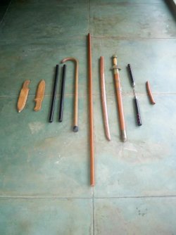
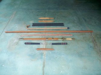
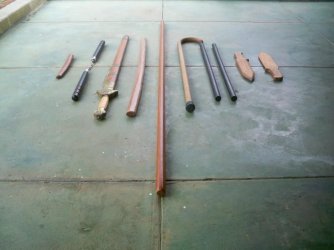
Karate Pictures for my Book
- Thread starter Makalakumu
- Start date
OP
OP
OP
OP
OP
OP
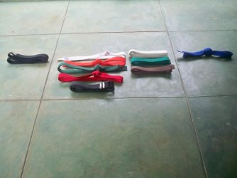
Have to be honest, I don't care for any of them, but #4 in both groups is best. Group 1 #3 looks just messy. Rest are lacking 'something' to me, but I can't quite put my finger on it yet.
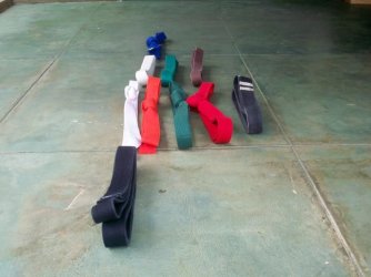
group 3, #1 is best. Would be best cropped at the bottom crack-line. Better if the background (fence) was either removed or blurred to focus on the gear.
OP
OP
OP
OP
OP
OP
OP
OP
OP
OP
Group Eight. Which is best? Why?
Attachments
OP
OP
OP
OP
OP
OP
Have to be honest, I don't care for any of them, but #4 in both groups is best. Group 1 #3 looks just messy. Rest are lacking 'something' to me, but I can't quite put my finger on it yet.
Do you think a new background would work? Beach sand? I'm looking for an old and used look. Martial Arts equipment in pristine form isn't being used.
OP
OP
group 3, #1 is best. Would be best cropped at the bottom crack-line. Better if the background (fence) was either removed or blurred to focus on the gear.
Thanks. This is all pre-photoshop.
It's something to do with the layout in general. There's a randomness that doesn't work for me. Doesn't mean it's wrong, just not what I find pleasing.Do you think a new background would work? Beach sand? I'm looking for an old and used look. Martial Arts equipment in pristine form isn't being used.
Another problem I have with most of them is the shark fin shaped island in the back ground fighting for attention with you. Soften the backgrounds so that attention is focused on you.It's something to do with the layout in general. There's a randomness that doesn't work for me. Doesn't mean it's wrong, just not what I find pleasing.
G5-#4, G6-#2, G7-#2, G8-#1,2,4,8 G9=all okThanks. This is all pre-photoshop.
Some things to look out for: weird stuff growing from head (hand sticking out of forehead, palm fronds giving a crown look, an airplane launching fro your eyes, etc)
Also, leave some additional space in front of you, to indicate you are moving in that direction.
Look at the pictures but mentally remove you from them. Look for distractions in the background that will pull eyes off of you.
I'll try and go back over these in a little bit, see what else I can offer.
Are you shooting yourself, or have someone else shooting? What are you using?
OP
OP
Are you shooting yourself, or have someone else shooting? What are you using?
Yeah, that is me. My wife is taking the pictures. We are using a pretty nice digital camera, 10 megapixals.