Critique, If You Would

OnlyAnEgg

Senior Master
MTS Alumni
I have put together a website for my sensei and school at
http://pfbk.white.prohosting.com/

This is a temp location. Our own Bob will host the site when it's completed.

I am asking for any and all critique of the site as it currently stands.

Admins: feel free to move this post to any appropriate locations.

thanks!

egg
 
be sure to add the street and state on the map page
I know it is on the contact page but it helps to have it in more that one location
 
be sure to add the street and state on the map page
I know it is on the contact page but it helps to have it in more that one location
I personally like to see that on most pages somehow... It's too easy for a link to be to a page "inside" the website, and it can be frustrating to try to find out where the place is...

A couple more points:

Just for your own convenience, in your "About" page... I'd rephrase around the "we've been here six years" part just so that you don't have to tweak that page every year.

I like the bullets better than the paragraph for your sensei's accomplishments. The paragraph ends up reading "He did something... He did something else... In whenever, he did this other thing..." and seems repetitive to me. Bullets are just simply easier for me to follow. I'd also make it a point to spell out what AKJU and other associations are somewhere on that some page. Not everyone is familiar with every martial arts organization.

I'd also list the class location along with the schedule. It's just easier, in my opinion, to find the when & where together. Keep the map and location page separate; I like that -- but I'd simply list the address or add a sentence and link to the map page like "All classes meet at <link>"

And... do you need to credit anyone for the definitions or photos? That's just an issue that I'm always looking out for.

Now... Other than where I've torn it apart ;) -- great job!
 
Overall, it looks really nice! The home page could use a little color; the black on white is easy to read, but doesn't really draw the eye in. Maybe you could put the titles in blue or something easy to read, but still dark enough to be clearly legible.

Also, the word "terminology" didn't load on my computer (Windows XP Home, Mozilla Firefox), and the columns weren't properly lined up; there was a column of English numbers in about the center of the frame, and then lower down, on the left, a transliterated list - but that's probably just a formatting issue. Actually, you might consider adding digits to the list in addition to number words - possibly even line it up the way you did with the other terminology, which I found to be very readable.
 
I'd loose the frames, generally those aren't used anymore and scroll bars are annoying when they are anywhere but one place. Tables or CSS will give a much cleaner layout.

I like the simplistic layout, but a little color might help. Perhaps a different background color for the header and navbar?

You have a typo in the code on the terms page:

Code:
<br>Twenty
</tr>
<td valign=top>
Ichi&nbsp;&nbsp<i>(ee-chee)</i><br>

Which breaks the layout, the english and Japanese aren't side by side. </tr> -> </td>

On a non-technical note, you could probably combine the classes and the location pages. Anyone looking for one is going to need the other. (Could probably get the contact page in on that as well) ;)

It's also pretty much convention to have "Home" as the first link, not the last.

Most of the pages are tabled. I suppose if I bothered to learn css, I could clean out the frames.

Color? Color?! I suppose I could do something about that. Maybe a glow or radiate in red, perhaps. This's a first run.

I hope to tweak the tech side much more when I get on silverstar and start working the php.

Term page is fixed. No longer as dependant on window size or resolution. I built it on 1024 by 768.
 
FIxed?

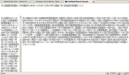
SHows up completely buggered now, just random Chinese characters for me ;)

Don't even need CSS to clean out the frames, just one big table as a template with everything else inside it.

CSS is good, but can be a pain too when it comes time to make it work in IE :)
 
I think something went kablooie... now I get this:

&#26684;&#28020;&#15980;&#15370;&#25960;&#25697;&#2622;&#15370;&#26671;&#24933;&#15972;&#2570;&#25148;&#25711;&#15993;&#25148;&#15986;&#15370;&#24948;&#27746;&#15973;&#15370;&#29300;&#2622;&#29756;&#8292;&#24950;&#26988;&#28263;&#29757;&#28783;&#15422;&#28009;&#8295;&#29299;&#15715;&#26914;&#24941;&#25959;&#12147;&#29284;&#26465;&#28271;&#27182;&#26480;&#15906;&#12092;&#25716;&#15422;&#25716;&#30240;&#27745;&#26473;&#15726;&#28532;&#15984;&#26940;&#26477;&#29472;&#25458;&#8765;&#28009;&#26465;&#29541;&#30511;&#27749;&#28515;&#25965;&#27182;&#26480;&#15906;&#15392; &#28518;&#29806;&#29472;&#31337;&#15717;&#15925;&#28532;&#17952;&#26977;&#26226;&#25961;&#25708;&#16928;&#24933;&#26723;&#19232;&#29281;&#29793;&#8293;&#28239;&#26988;&#25966;&#2606;&#28732;&#16958;&#8293;&#24944;&#26996;&#28261;&#8308;&#26999;&#26740;&#29984;&#8307;&#29537;&#30496;&#8293;&#30050;&#27753;&#8292;&#28257;&#8292;&#30821;&#24944;&#25710;&#29728;&#25960;&#30496;&#25189;&#26995;&#25972;*&#18208;&#28261;&#29285;&#27745;&#26912;&#26222;&#29295;&#24941;&#26996;&#28271;&#26912;&#8307;&#30305;&#26977;&#24940;&#27746;&#8293;&#31074;&#29984;&#26995; &#26478;&#29728;&#25960;&#27680;&#28265;&#29547;&#28448;&#8302;&#26740;&#8293;&#25964;&#29798;*&#19744;&#29295;&#8293;&#28787;&#25445;&#26217;&#25449;&#26912;&#26222;&#29295;&#24941;&#26996;&#28271;&#30496;&#27753;&#8300;&#25954;&#24864;&#25700;&#25701;&#24864;&#8307;&#26740;&#8293;&#26995;&#25972;&#26400;&#28530;&#29559;&#15406;&#26159;&#28271;&#15988;&#25148;&#15986;&#25148;&#15986;&#15370;&#15977;&#30012;&#19774;&#8281;&#16715;&#16722;&#17748;&#17184;&#17746;&#17477;&#12092;&#15989;&#25148;&#15986;&#25148;&#15986;&#18698;&#17184;&#19791;&#8261;&#20308; &#22816;&#21839;&#22304;&#21577;&#8264;&#22861;&#17696;&#20557;&#22868;&#18464;&#20033;&#21316;&#15406;&#29282;&#15422;&#29282;&#2622;&#8202;&#8265;&#19777;&#16672;&#19488;&#22337;&#16672;&#18754;&#18756;&#18254;&#17184;&#21577;&#23113;&#20037;&#25148;&#15986;&#16650;&#8276;&#20302;&#21536;&#19785;&#8261;&#18515;&#19521;&#8268;&#8265;&#22085;&#21061;&#21792;&#17747;&#21536;&#17736;&#25148;&#15986;&#21514;&#17221;&#20040;&#20809;&#17749;&#8275;&#16724;&#18261;&#21576;&#21536;&#8271;&#17741;&#18720;&#8270;&#8257;&#16717;&#20046;&#21061;&#25148;&#15986;&#21514; &#16712;&#8276;&#18775;&#19532;&#18720;&#17998;&#18764;&#21571;&#20512;&#21061;&#20307;&#16718;&#8268;&#20041;&#21834;&#22866;&#15406;&#29282;&#15422;&#29282;&#2622;&#19978;&#21071;&#22304;&#19529;&#8268;&#8265;&#20290;&#18756;&#22860;&#18464;&#21057;&#8269;&#20033;&#20313;&#17742;&#17696;&#17240;&#20549;&#15444;&#29282;&#2622;&#20041;&#17184;&#21313;&#21317;&#20256;&#8262;&#19781;&#21061;&#17735;&#17230;&#8281;&#17742;&#17477;&#8275;&#18519;&#21061;&#16965;&#15449;&#29282;&#2622;&#22861;&#18464;&#20047;&#21071;&#8236;&#18764;&#17734;&#8236;&#20291;&#20053; &#21076;&#8281;&#21071;&#21536;&#17736;&#19488;&#22089;&#21317;&#25148;&#15986;&#16650;&#17486;&#20512;&#22856;&#18771;&#16707;&#8268;&#16723;&#17734;&#22868;&#20256;&#8262;&#21583;&#17736;&#21330;&#19744;&#22849;&#25148;&#15986;&#17418;&#20549;&#20037;&#8260;&#20565;&#20047;&#19744;&#8281;&#20043;&#22351;&#17740;&#18244;&#8261;&#20033;&#8260;&#20545;&#19536;&#17225;&#21569;&#20297;&#8270;&#17999;&#21536;&#17736;&#17747;&#21536;&#17221;&#20040;&#20809;&#17749;&#11859;&#25148;&#15986;&#25148;&#15986;&#2570;&#18516;&#21321;&#18720;&#8275;&#22861;&#17184;&#17746; &#17477;&#11552;&#19232;&#21057;&#21569;&#15429;&#26927;&#15422;&#29282;&#15422;&#29282;&#2622;&#25148;&#19262;&#28526;&#27767;&#25701;&#25959;&#26912;&#8307;&#25954;&#29811;&#30496;&#25960;&#8302;&#29801;&#26912;&#8307;&#24944;&#29555;&#25701;&#28448;&#8302;*&#25939;&#29550;&#26981;&#17440;&#28257;&#31086;&#20512;&#26984;&#27756;&#28777;&#15475;&#25135;&#15422;&#28009;&#8295;&#29299;&#15715;&#26914;&#24941;&#25959;&#12147;&#26723;&#28783;&#12848;&#27182;&#26480;&#15906;&#15370;&#15984;&#30033;&#29541;&#26996;&#28271;&#8307;&#29295;&#26144;&#25957;&#25188; &#25441;&#16235;&#20512;&#25964;&#29537;&#8293;&#25964;&#8308;&#29557;&#27424;&#28526;&#11895;&#12092;&#25716;&#15422;&#29743;&#15986;&#15370;&#29743;&#25185;&#25964;&#15422;&#29282;&#15422;&#29282;&#2622;&#25404;&#28261;&#25972;&#15986;&#25924;&#26995;&#28263;&#25120;&#8313;&#24892;&#26656;&#25970;&#15718;&#27938;&#26977;&#29804;&#14959;&#24932;&#24943;&#29810;&#28519;&#16484;&#24953;&#28520;&#11887;&#28515;&#8813;&#19006;&#28009;&#18464;&#28021;&#25965;&#15468;&#24879;&#15422;&#29282;&#2622;&#28488;&#29811;&#28265;&#8295;&#31074;&#15392;&#8289;&#29288;&#26213; &#8765;&#29800;&#28788;&#12090;&#29487;&#27753;&#25974;&#29554;&#24948;&#29554;&#29801;&#29541;&#28206;&#29797;&#8751;&#29728;&#29281;&#25959;&#15732;&#28255;&#30565;&#21310;&#27753;&#25974;&#21362;&#24948;&#8306;&#25943;&#17506;&#29541;&#26473;&#29550;&#18720;&#25454;&#15406;&#24879;&#15422;&#25391;&#28261;&#25972;&#15986;&#2570;&#12092;&#28514;&#31076;&#2622;&#12092;&#29800;&#27757;&#2622;&#2570;
 

Attachments

  • $Screenshot-7.jpg
    $Screenshot-7.jpg
    89.6 KB · Views: 181
FYI... I just checked it in both IE7 and Firefox, and it's working fine.
 
I think the navigation bar would be better off shrunk down a little (so viewers dont' have to scroll to see all the navigation elements) and not in a frame. Perhaps add in a background on the navigation for good measure. Maybe something like a square behind it with a tatami texture applied? Might give the site a better flow.
 
Buffed out the menu links in the left frame with a little java. Made font consistant across the site and compressed and compacted to eliminate scroll bars at 1024x768 and above.
 
I was just looking at it again...

I'd strongly suggest that you remove the dates of birth; I'd be hesitant even about only listing the year. With the name and DOB, you've just exposed them to identity theft... Which I'm sure you don't want to do!
 
Back
Top