You are using an out of date browser. It may not display this or other websites correctly.
You should upgrade or use an alternative browser.
You should upgrade or use an alternative browser.
Old vs. New Logo
- Thread starter The Kai
- Start date
The new one is great!! I like it!!
Mike
Mike
parkerkarate
Blue Belt
That looks pretty cool.
Very cool. ")
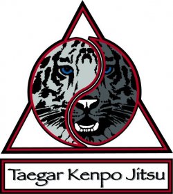
Looks Good Todd
Out of curiousity, tis a Tiger right? Do the blue eyes have a meaning? Maybe it's just me, but the right side of the face looks rather wolfish.
I do like it~!
~Tess
Out of curiousity, tis a Tiger right? Do the blue eyes have a meaning? Maybe it's just me, but the right side of the face looks rather wolfish.
I do like it~!
~Tess
Kai I like the codtrast, maybe when you have time come up with some inspiration for me, I've been struck for almost a year.
Terry
Terry
Navarre
Master Black Belt
That looks really good, Kai. It is much more distinctive and unique than the previous logo.
Where will this logo appear? Uniforms, jackets, the wall, where? I know that with our school logo, total number of colors and gradients and such were a consideration when trying to get uniforms and such made to look right. Do you anticipate any problems with this?
Where will this logo appear? Uniforms, jackets, the wall, where? I know that with our school logo, total number of colors and gradients and such were a consideration when trying to get uniforms and such made to look right. Do you anticipate any problems with this?
It looks good, the only thing I'd worry about is that there might not be enough contrast on the right side to show up effectively in some print or at smaller size it might look cluttered, like if you where to put it on a business card, would the tiger be recognizable or just look cluttered?
OP
The Kai
Master of Arts
- Joined
- Apr 15, 2004
- Messages
- 1,925
- Reaction score
- 33
- Thread Starter
- #12
Navarre said:That looks really good, Kai. It is much more distinctive and unique than the previous logo.
Where will this logo appear? Uniforms, jackets, the wall, where? I know that with our school logo, total number of colors and gradients and such were a consideration when trying to get uniforms and such made to look right. Do you anticipate any problems with this?
Well the screen print with the number of colors is a little more then I would have liked
I intend to plaster the damm thing everywhere
OP
The Kai
Master of Arts
- Joined
- Apr 15, 2004
- Messages
- 1,925
- Reaction score
- 33
- Thread Starter
- #13
Andrew Green said:It looks good, the only thing I'd worry about is that there might not be enough contrast on the right side to show up effectively in some print or at smaller size it might look cluttered, like if you where to put it on a business card, would the tiger be recognizable or just look cluttered?
Well they say just lighten it upa tad and it should go well
OP
The Kai
Master of Arts
- Joined
- Apr 15, 2004
- Messages
- 1,925
- Reaction score
- 33
- Thread Starter
- #14
terryl965 said:Kai I like the codtrast, maybe when you have time come up with some inspiration for me, I've been struck for almost a year.
Terry
Sure PM me what you want to do, give me a couple of years and I'll have it for you! Seriously if you need a sounding board
Tripitaka of AA
Yellow Belt
Nice logo, looks distinctive, memorable and unusual enough to stand out from the crowd. Well done.
Is the name new?
Does it have any meaning? Is the style based on a Japanese style? The word "Kempo" is Japanese. "Jitsu" is usually seen as an earlier/older romanisation of the Japanese word now commonly written as "Jutsu". "Taegar" is not Japanese, so why not "Tiger"? I do not intend this as criticism, I am just thinking out loud, these are the questions I asked when I saw the name...
Cool! Looks like you changed the name of the style as well as its logo?
Navarre
Master Black Belt
It seems you've thought about the design quite a bit. I mentioned the color separation issue because it had been a problem for me.
What we can do on screen or for the web becomes much harder when trying to go for print, silkscreen, etc. Have you actually talked to some companies to get their input on how easily reproducable it will be to maintain high quality?
Hopefully it will all go well; it is a nice design. Much better than my original design for Bloated Opossum Kung-Fu.
OP
The Kai
Master of Arts
- Joined
- Apr 15, 2004
- Messages
- 1,925
- Reaction score
- 33
- Thread Starter
- #18
Yea I talked to screen printing and embroidery people so far.
taegar is a mashed together word (TKD and Hung gar) both of which Gm has elements of in his system...Hell he uses the word so to kiss up a little..
And yes I am changing the name of my dojo
taegar is a mashed together word (TKD and Hung gar) both of which Gm has elements of in his system...Hell he uses the word so to kiss up a little..
And yes I am changing the name of my dojo
OP
The Kai
Master of Arts
- Joined
- Apr 15, 2004
- Messages
- 1,925
- Reaction score
- 33
- Thread Starter
- #19
Yes Ive talked to screen printing people and the embroidery folks
taegar is a mash together of TKD and Hung gar both of which there are elements of in Gm teaching.....well , he uses the word, so...
for thing outside the school we'll go with Tiger so ads and phone listings are a tad clearer
yes I am changing the name of the school
taegar is a mash together of TKD and Hung gar both of which there are elements of in Gm teaching.....well , he uses the word, so...
for thing outside the school we'll go with Tiger so ads and phone listings are a tad clearer
yes I am changing the name of the school
masherdong
2nd Black Belt
Looks good!